How to make Useless Enterprise Architecture Diagrams
Background on this diagram
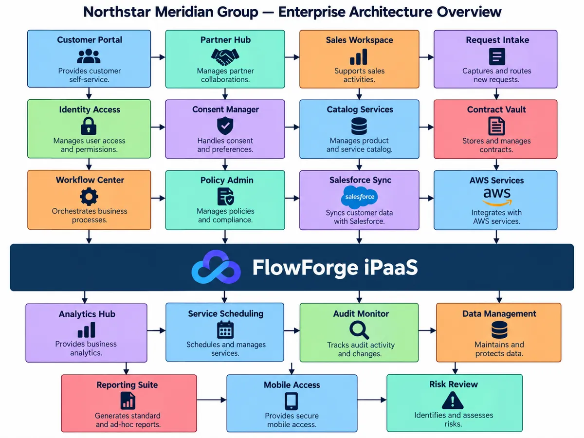
I had ChatGPT generate this diagram for me. It must have seen many a similar "Architecture" diagrams because it gave me almost exactly what I wanted. Here's the prompt:
Generate a generic "Enterprise Architecture" style diagram for me for some made-up company. I'm trying to highlight the things the I dislike in these diagrams, so the one you generate should:
- Have at least one big horizontal box which everything immediately above it points down to it and it points to every box immediately below it. The box should have some fake SaaS integration company logo in it.
- The other boxes are numerous and organized into rows with arrows between them but none of the arrows are labeled.
- The boxes are relatively small, but each box has a title, and image, and only one short sentence describing what the service does.
- Each box describes some sort of capability, but nothing about how it will be implemented.
- Each box is colored. The colors are reused, but there's nothing that tells the reader whether or not the colors mean anything.
You have probably seen a diagram like this in some form. This is the sort of diagram that an Enterprise Architecture team will present to leadership as the "definitive end-state of engineering organization alignment and eliminating technical debt". This same diagram will then be presented to the tech teams with little more guidance than "here's the goal". Which, in my opinion is... pretty unhelpful.
One of my biggest problem with these sorts of diagrams is the semi-implicit agenda they always seem to push. "We will use FlowForge iPaaS", "Nothing will integrate outside of this layer" (never mind the arrows between other boxes which don't go through the big bad integration layer), "these are the only important things that we do", and so on. This makes it very hard to have an honest discussion around what the future should look like, because you can't avoid the prominence of whatever has the most arrows pointing into it or out of it. Discussing things that are missing is easy, the architect will just add another box. Discussing things that don't need to exist is hard, because somebody will inevitably say that it needs to be there, even if it's a capability that doesn't exist today. And heaven forbid a scenario where the integration layer isn't appropriate...
Oftentimes, these diagrams represent an impedance mismatch: much of the language and information is target to business people by way of discussing capabilities, but every so often there will be something that is only relevant to technical people occupying the same space. "AWS Services" and "Salesforce Sync" is functionality, not capability; business people will gloss over these because there are so many other dazzling boxes to talk about, but developers will sweat the vagaries of these because those are the only things on these diagrams written in their native language. All of these thing then point to the biggest box, which is the real subject that the presenter wants both sides of the audience to take away from the slide. Business people again don't really care what's there because that's a problem for the technical people to solve, as long as we throw them some money to procure whatever the "platform" is that they need to enable all the other shiny bits. The developers are puzzled because this platform is entirely net-new beyond some prototypes that the Enterprise Architects threw together and a warm smile from the Account Executive who assures you that you have the perfect use case for their product.
Similarly, there's rarely much effort in talking about how to get there, which is just as (if not more) important than the end state itself. To pose the end state in such definitive terms frames the situation as a technology problem with a definitive solution. Nothing is open ended; it is self-evident that this is what we need, and these are the pieces to get us there, which ignores all of the learnings that will be accumulated along the way. It's like with story points: you estimate at the beginning of a project when you have the least amount of information about it and, at least in my experience, never go back and re-estimate things even after you have more information about what challenges will come up. If you have an Enterprise Architecture team, you are almost definitely already an established company trying to improve a bunch of systems that people (usually developers) are not happy with. The current state cannot be discounted when trying to decide what the end state needs to be, but diagrams like this rarely take that into account. They tell you what you want, even though the author likely has less knowledge how how the pieces are working together today than you do.
So, how do we fix this? My gut reaction is that the answer is "simple" but not necessarily "easy": make two diagrams, one for business people that's anchored in the business capabilities which are generally more abstract, and one for the tech folks that focuses on the nuts and bolts required to get there. The former really only needs to be sold to leadership once; the latter will need to be constantly course-corrected as knowledge is gained and tradeoffs for different approaches are evaluated. But, even this is likely a gross oversimplification of what that process would look like.